
Measuring Healthcare Accessibility in South Africa
Collaborators: World Bank Health Group (Dr. Mersedeh Tariverdi, Dr. Miguel Nunez del Prado Cortez), Svea Drekshagen, Vedant Sahu, Kari Hanson.
Project done as part of CME 291 Xplore, Spring 2024-25 quarter.
Work was presented at the SimBig 2025 conference, held in Lima, Peru.
Motivation
The World Bank Health Group studies healthcare delivery systems in various countries (especially in the Global South), and identifies underserved regions and areas of vulnerability. In the past, that has meant identifying healthcare facility (HCF) locations, and using road network data to identify the shortest time needed to access these resources. However, with the advent of the internet, there are a wider array of e-health services available, which changes the mode of analysis. Given information about physical health infrastructure in South Africa, as well as internet speed data at various locations, we would like to identify underserved regions so that policymakers can target them.
Methodology
The first challenge we faced was the extreme sparsity in internet connectivity data, which is based on ookla’s speed test, captured at various locations in the country. While having richer data would make the results more reliable, we have used a range of imputation strategies including Kriging and IDW (Inverse Distance Weighting) to fill in the missing data. We used the Jensen-Shannon Divergence (JSD) as a metric to measure our imputation quality.
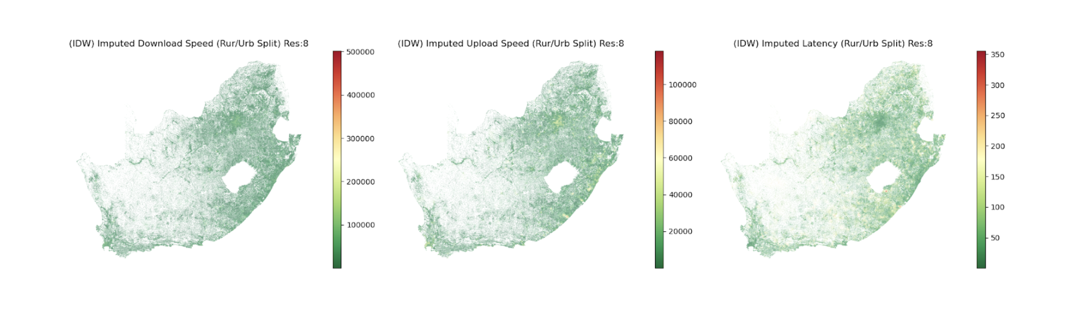 Figure 1: The imputation we have chosen for internet connectivity data
To model this problem, we take two graph-based approaches. The high-level idea is that if we can model the time taken to access a healthcare facility as a “physical cost” and define a “digital cost” based on the internet connectivity at the location, then we can imagine a graph that contains these costs. Once we have that, we can simply use Djikstra’s algorithm to identify the optimal cost from each location, which can later be clustered to identify vulnerable regions. A detailed explanation of the methodology and the results can be found in the report linked below.
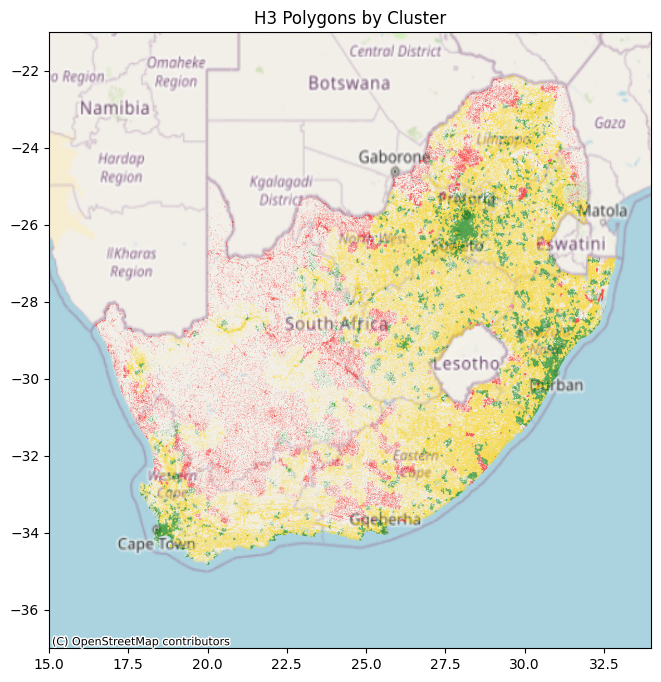
Figure 2: The polygons in green, yellow, and red correspond to regions of the country that have “Sufficient”, “Limited”, and “Insufficient” access to healthcare